The Peninsula Beijing
China

China
“The Peninsula”—a name that now conjures Asia’s quintessential chain of premium luxury hotels.
My trip this time was based at the Peninsula Beijing located in the heart of Beijing just a 10-minute drive from the Forbidden City.
Founded in 1928 by the Kadoorie brothers, founders of the Hongkong and Shanghai Hotels holding company, the history of The Peninsula Hotels is lengthy. In the chain’s subsequent expansion worldwide, in 1996 it took over management of The Palace Hotel, which had opened as China’s first luxury hotel. In 2006 the hotel was renamed The Peninsula Beijing.
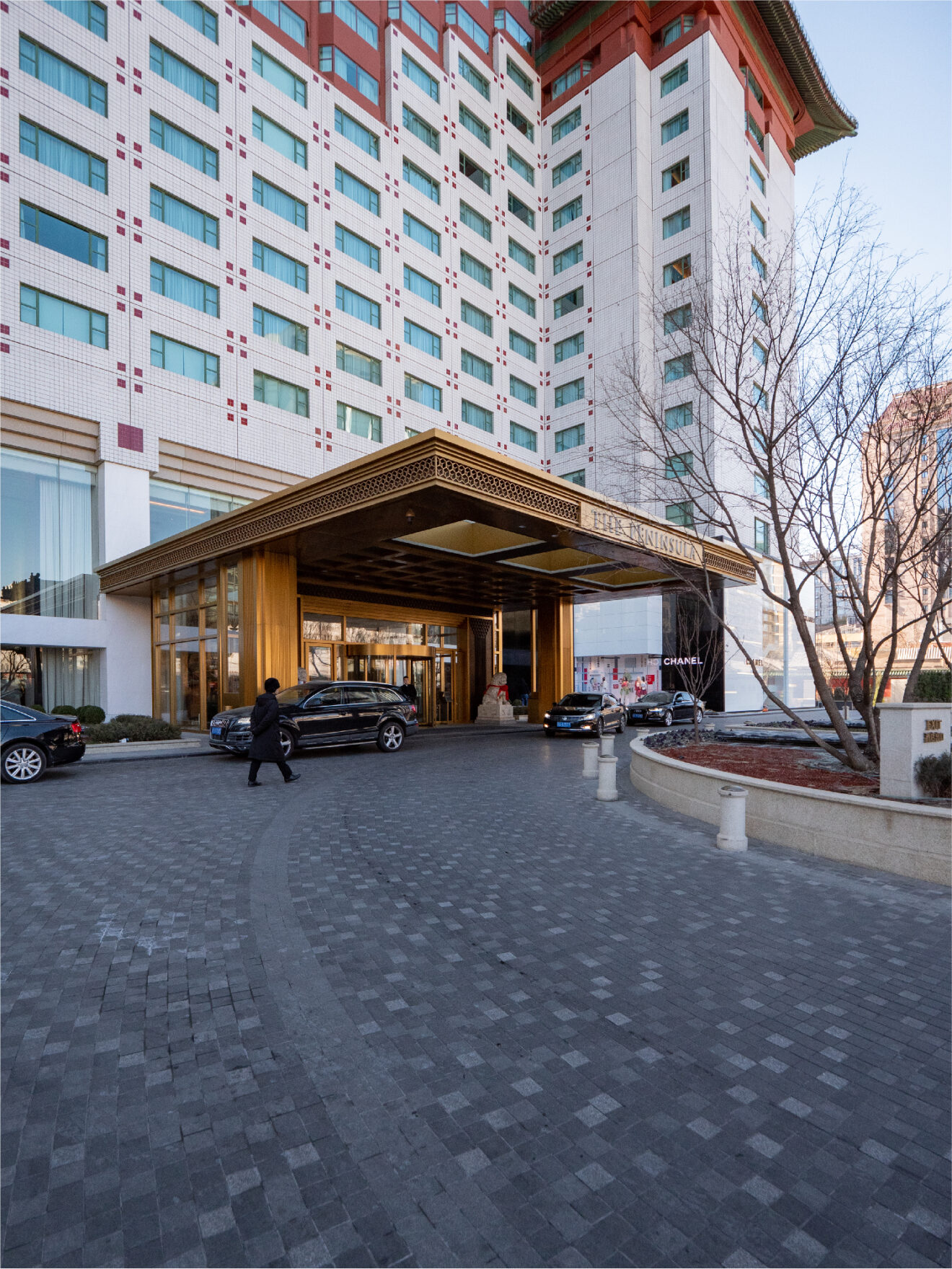
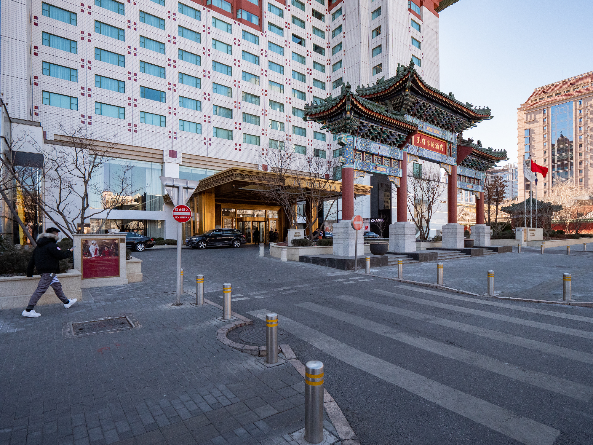
Setting aside consideration of its level of taste, with the monumental Chinese-style gate still standing at the front of the building, the hotel presents an overwhelming presence with its exterior to those who visit.
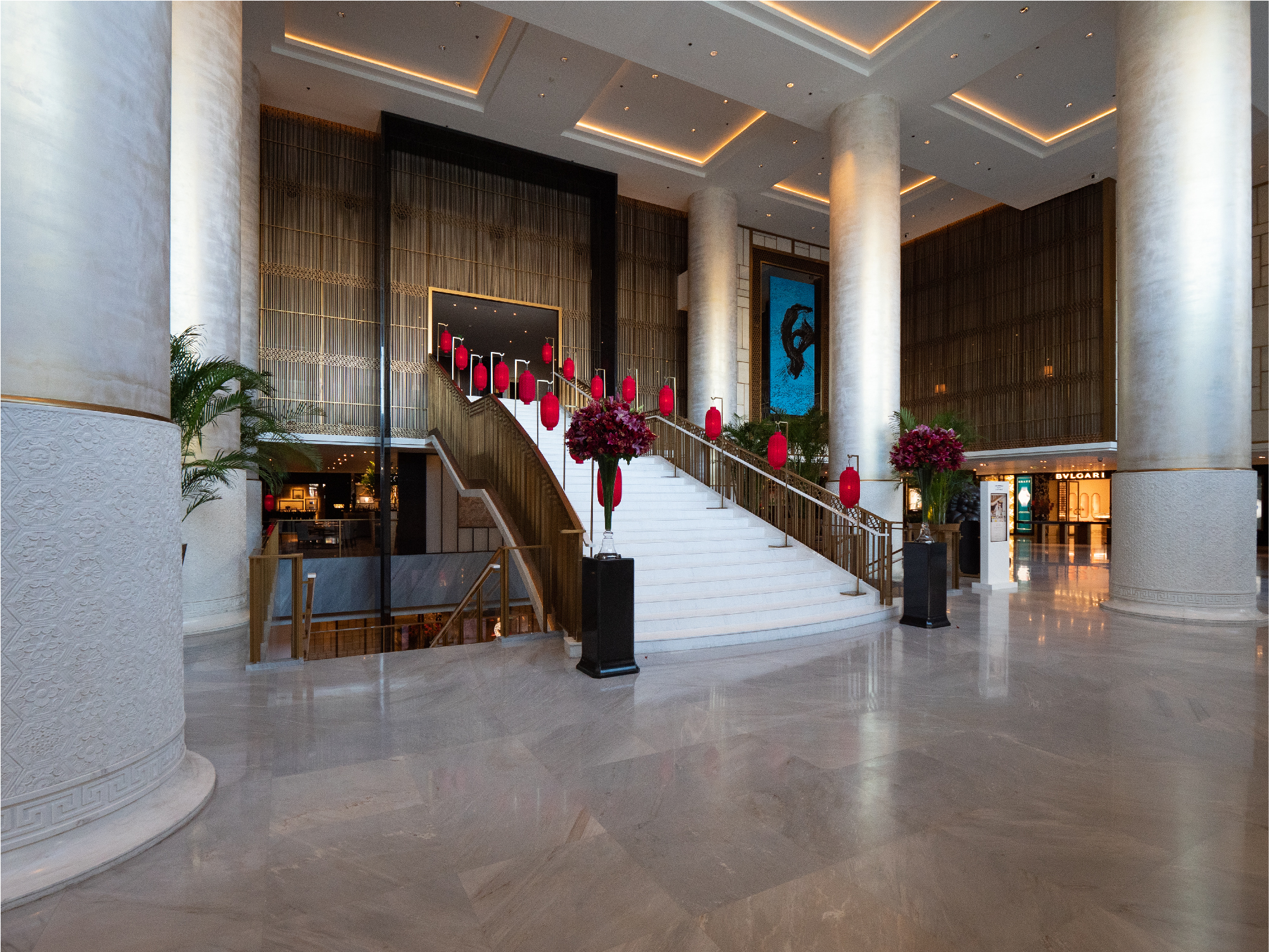
At the center of the entrance hall rises a massive stairway with an assortment of famous world brand shops surrounding it. I hear something to the effect that Louis Vuitton and other brands had their first shops in mainland China based here at this hotel.
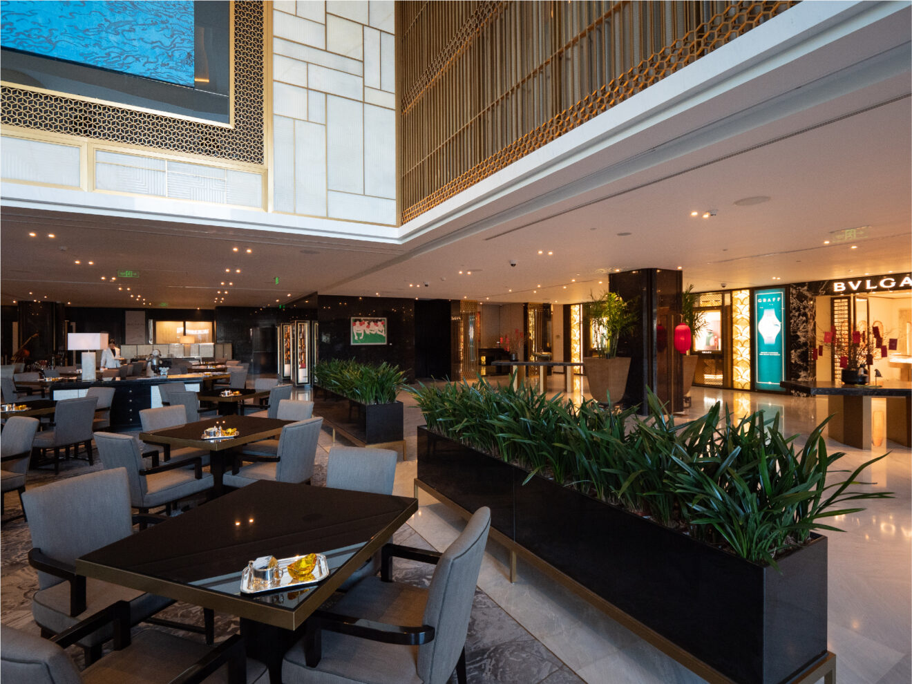
Out of sight behind the stairway is a dining space. I often find it hard to feel relaxed dining in large banquet halls, but here I felt comfortable, perhaps because of the way planted greenery was used to partition the space.
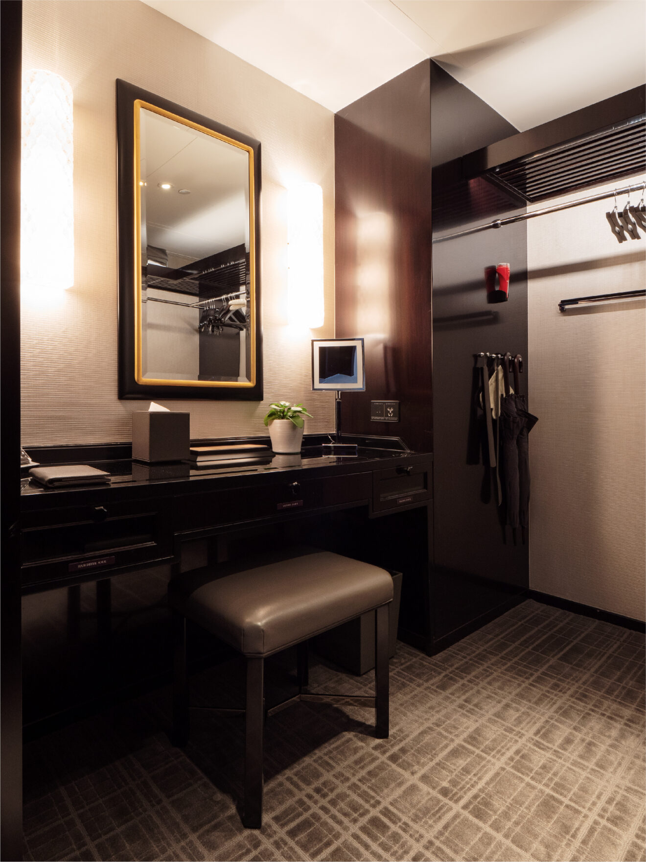
All 230 of the hotel’s rooms are suites. Just inside my room is a dressing room complete with a dressing table and closets to the left and right. In one corner is a nifty “valet box” with openings in both the guest room and hallway to allow pick-up and delivery of laundry, newspapers, polished shoes and so on.
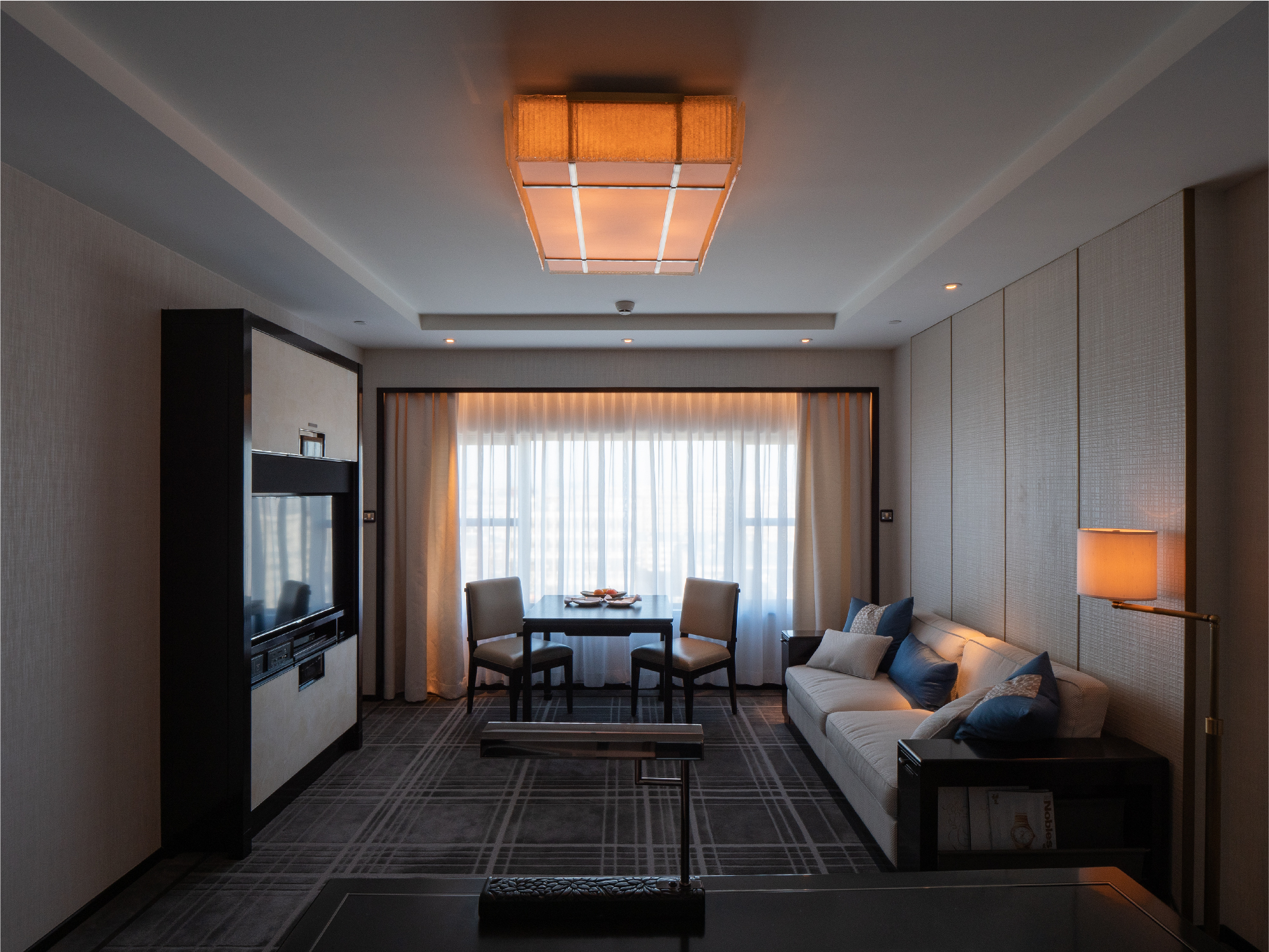
The spacious room is divided into a combined den/living room space and a bedroom. The uniform look of the room’s subdued coloration is striking too. The television console with panels that slide open and closed vertically helps reduce the large-screened television’s sense of presence in the room.
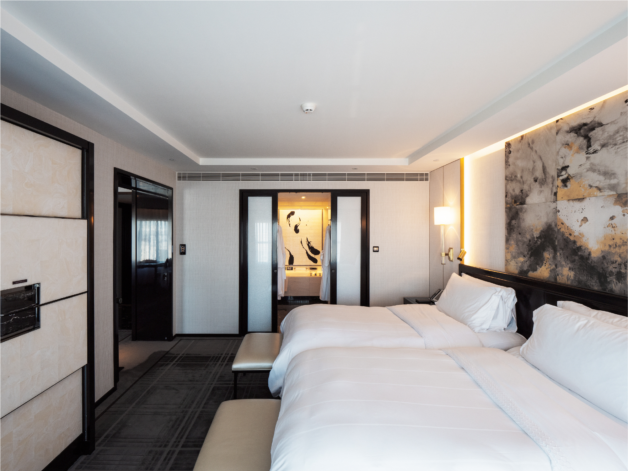
Further back in the suite is the bedroom, which has a floor plan as spacious as the living room’s. The room connects to the bathroom through double doors opening from the center outward. The wall next to the bathtub features mosaic-tiled Asian art, and the placement of an art object on this side wall gives the space a refined feel like that of the living room’s.
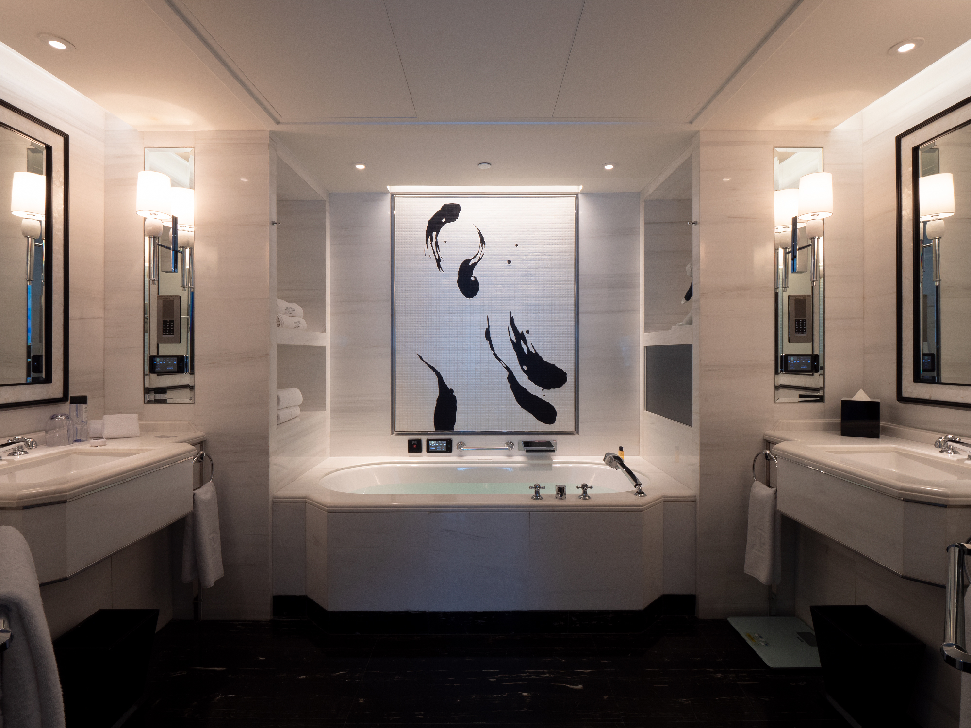
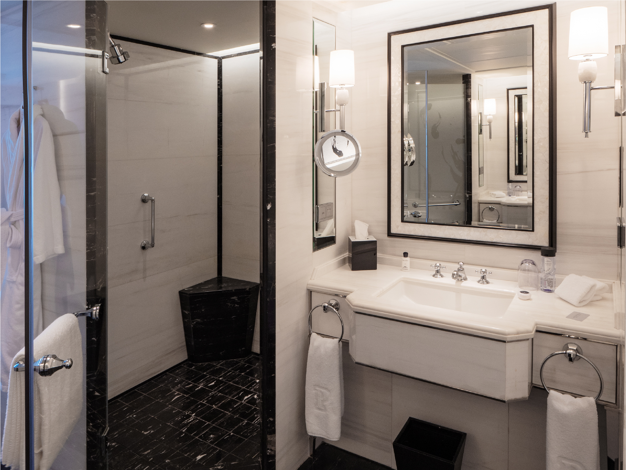
The Peninsula’s bathroom is designed to offer ease of use too, not just attractive looks. The room has a washstand placed at each side of a pathway in the middle between them, and situated next to them are a shower booth and toilet. This is an interesting use of the space, placing washstands to the left and right sides of the room, while ordinarily they tend to be lined up next to each other.
The shower booth and toilet spaces, set up with doors at slanted angles to form trapezoidal floor plans, are spacious and comfortable to use, I find upon checking them out. Even the bench casually installed at the back of the shower booth has been tiled in the same color as the flooring. While featuring a considerable number of elements, the bathroom avoids giving a “noisy” impression through the unifying effect of its fundamentally black and white color scheme.
Hotels with stylish design often tend not to make sufficient consideration of the places where towels are to be hung. On this point, the bathroom here shows thoughtful sensibility, placing towel bars and hooks right where one would want them to be. I got the sense that the designer must have gone to considerable lengths to ascertain the ease of use here.
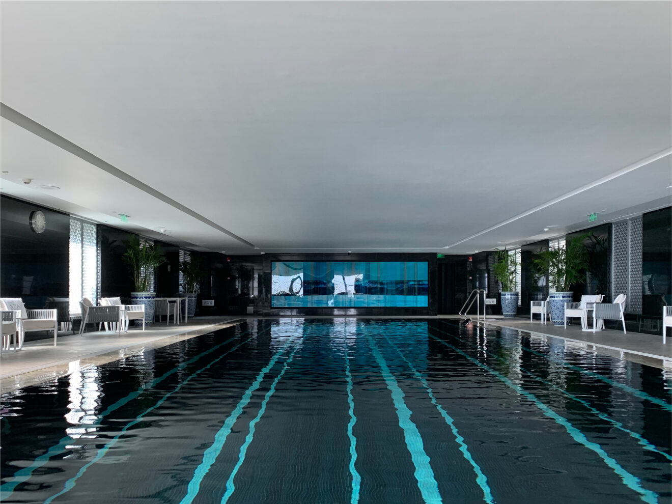
With its basic tone of black, the common-use swimming pool has a calm atmosphere, or it could be the relatively low ceiling that makes it seem that way, while planted greenery has a softening effect on the inorganic feel of the space.
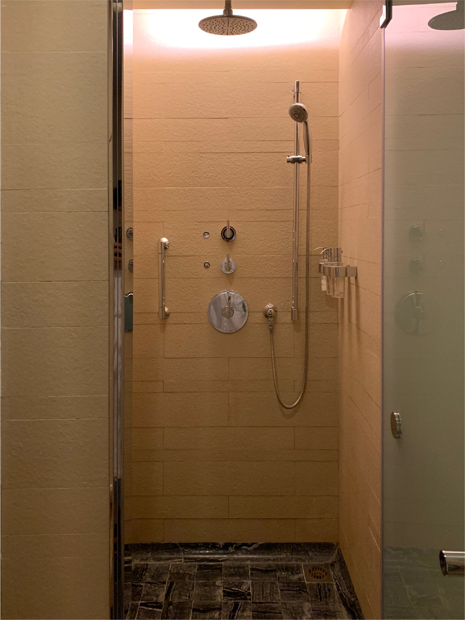
In the fitness center, I found shower booths partitioned with individual glass doors, offering a luxurious design with private changing rooms.
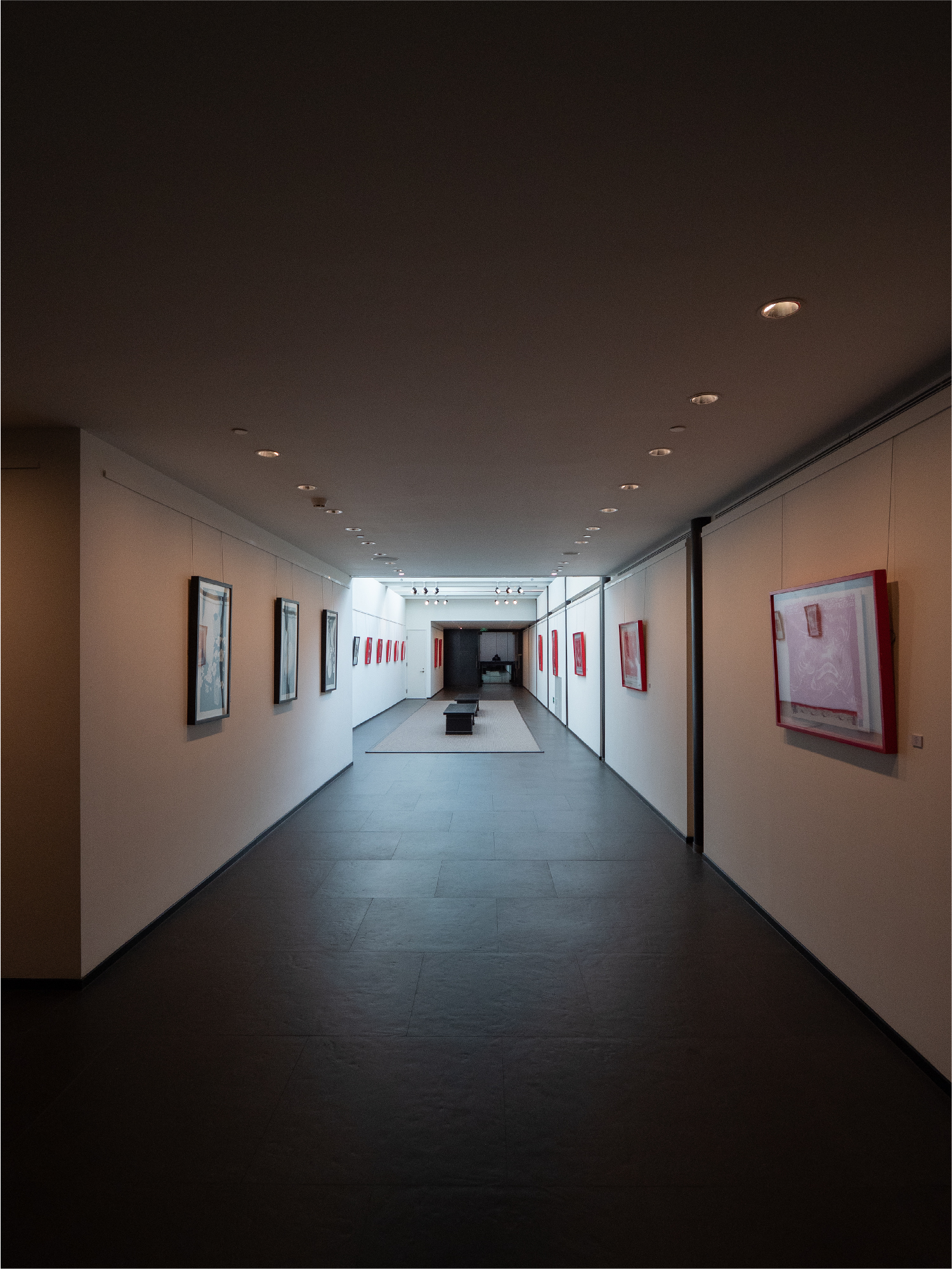
It was a very nice touch the way part of the hallway leading to the fitness center was made into an art gallery space. Having the work of local artists displayed like this had a stimulating effect each time I would pass by and provided the opportunity for communication as well.
I felt a little sense of disconnect between the impression given by the hotel’s exterior and entrance and the refined sensibility of the guest rooms. I also got the impressions that the rooms here ought to be spacious enough for family stays.
On this stay, I ended up going to a Chinese restaurant in front of the hotel on the recommendation of hotel staff. I found this to be a vibrant, traditional Chinese restaurant with a modern and comfortable interior. I get the sense that this kind of contrast can be something to enjoy when travelling in China. In China, though, the pace of development is dizzying on a citywide scale. So that could also be something to be enjoyed for the time being only.
