Hotel FranQ
Belgium

Belgium
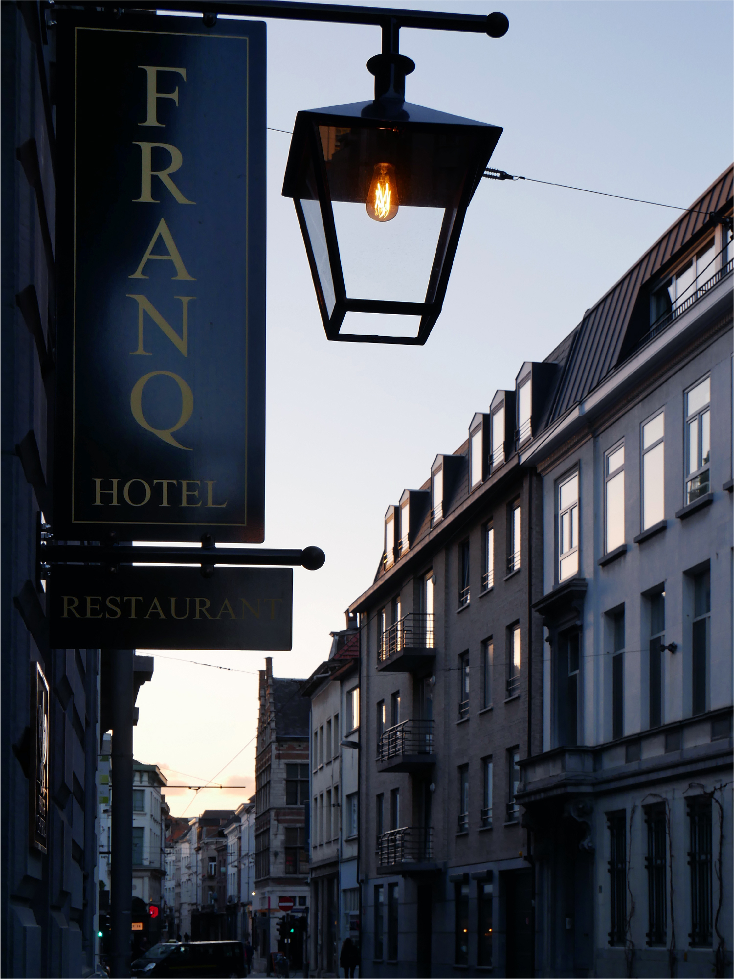
With its cobblestone streets, Antwerp presents a somehow nostalgic and also bustling townscape. Clattering along the narrow lanes guided by the car navigation system, a building with a stately air appears. A lovely signboard hangs in front, displaying its name: HOTEL FRANQ.
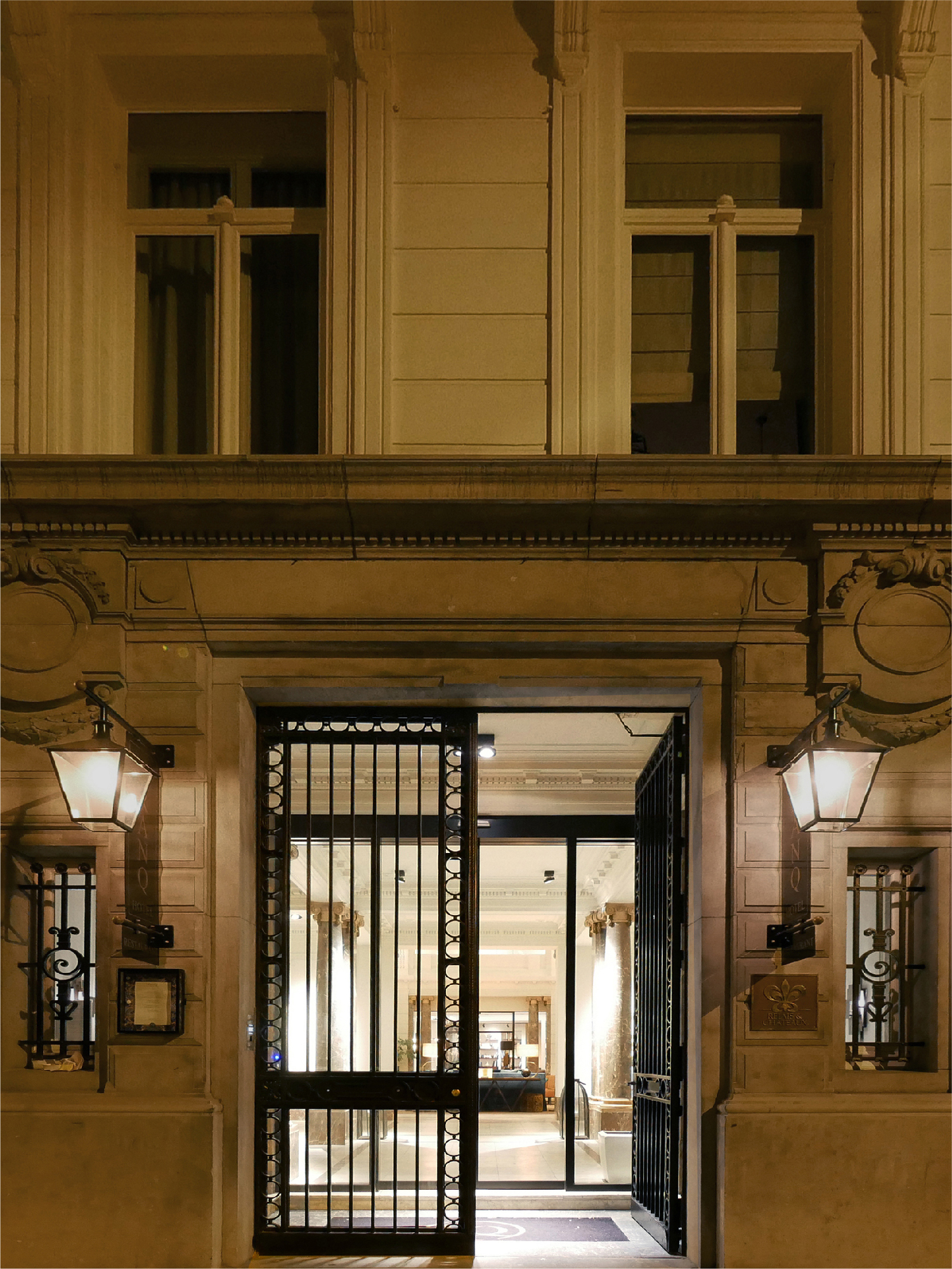
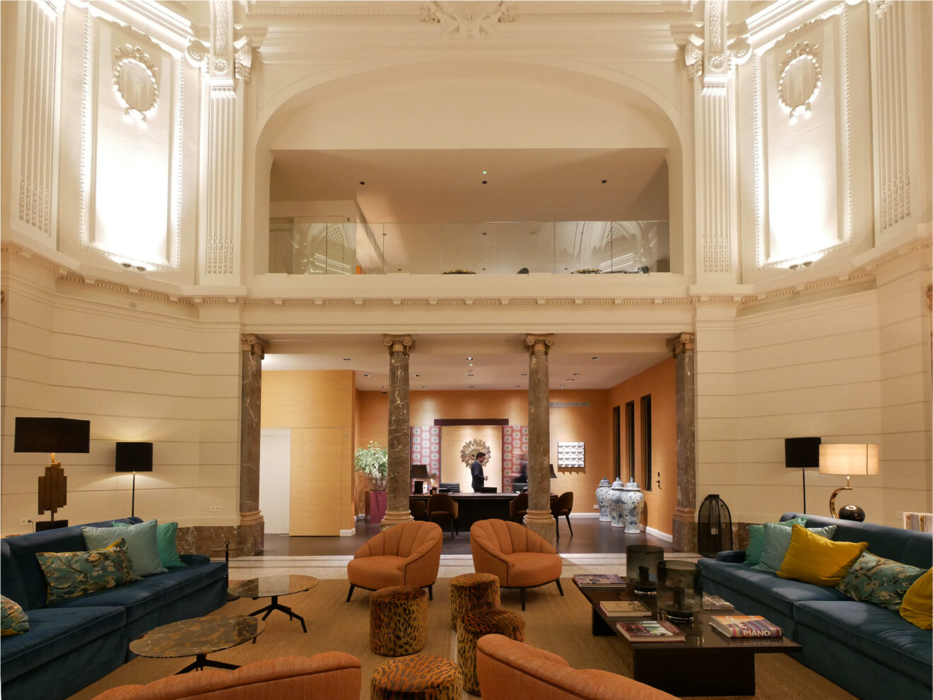
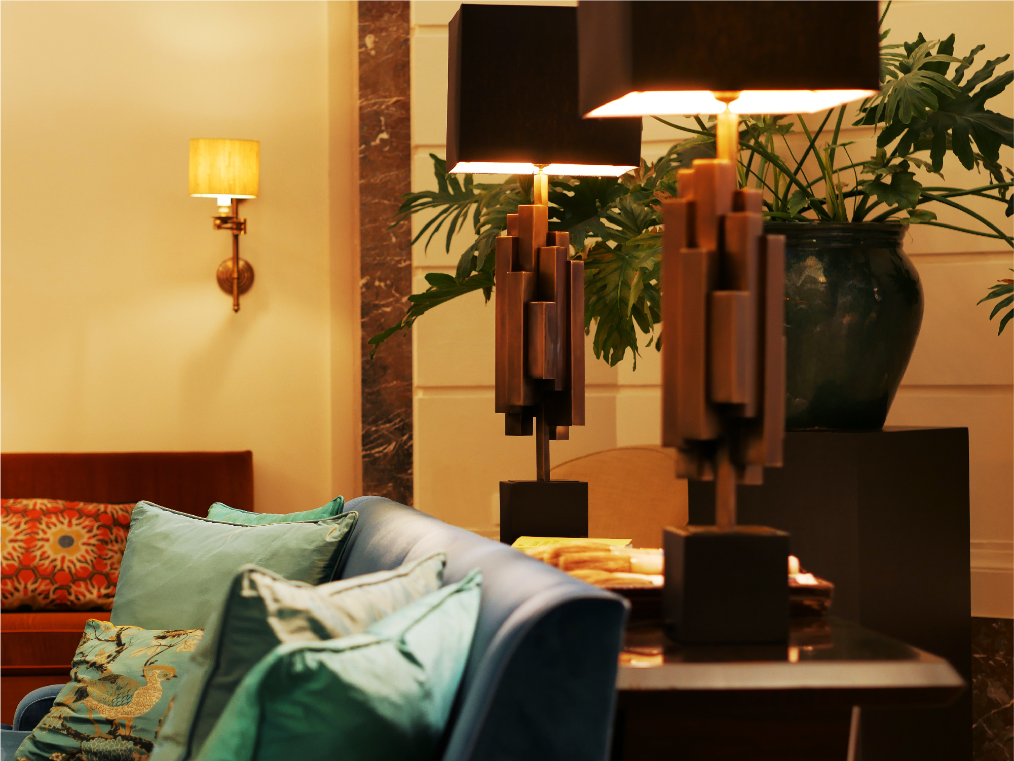
A solemn-looking front entrance leads into a capacious, high-ceilinged lobby with pronounced vestiges of its one-time history as a bank. Filled with light streaming in through skylights, the space features a chic arrangement of furniture in color combos displaying pop sensibility. The contrast between the historic building and modern furnishings is just fantastic.
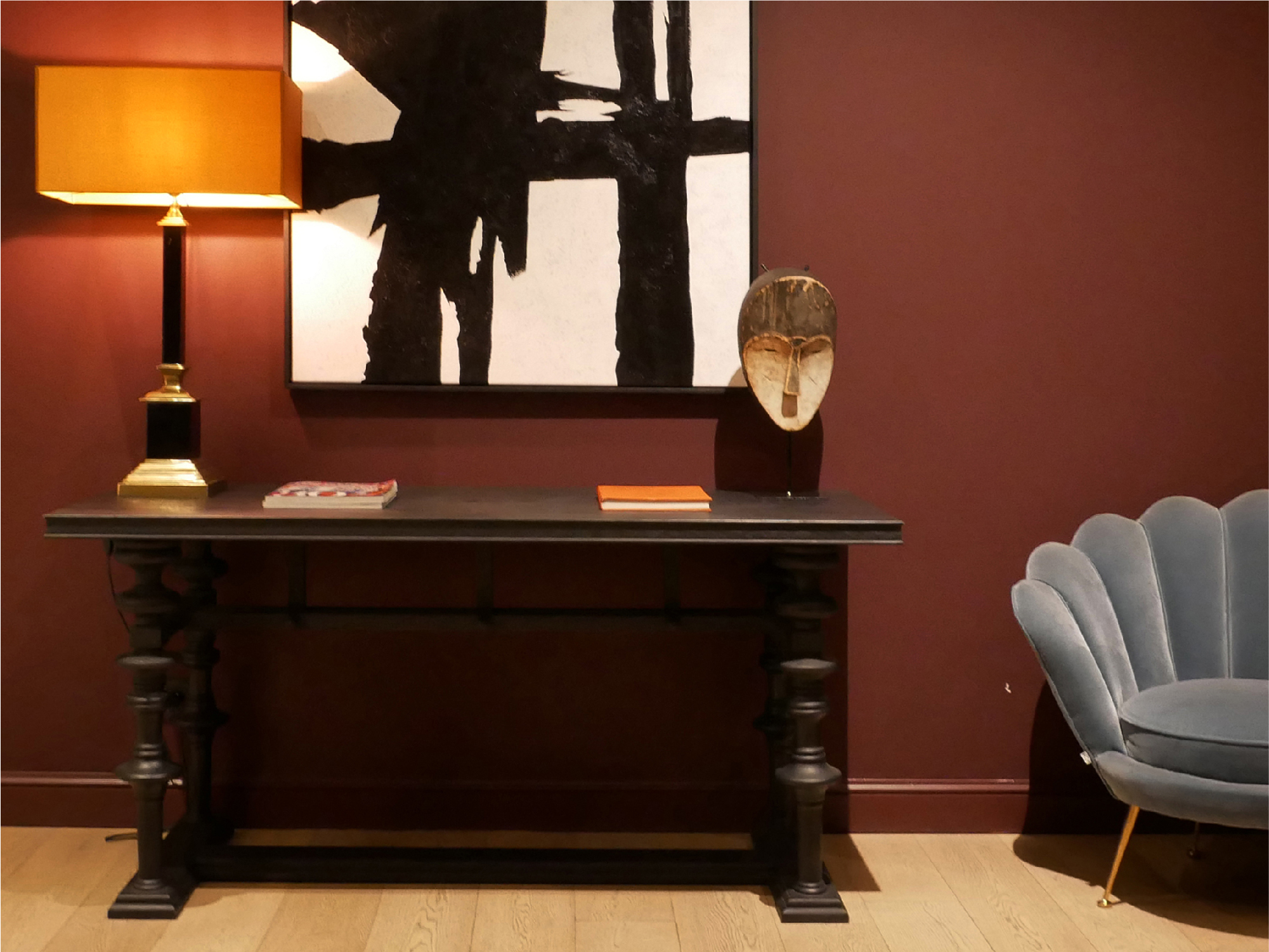
The hallway in front of the elevators alone has walls painted in Bordeaux red and display shelves there as well. It’s in the use of its spaces serving no special purpose that one really gets a taste of a hotel’s sensibilities.
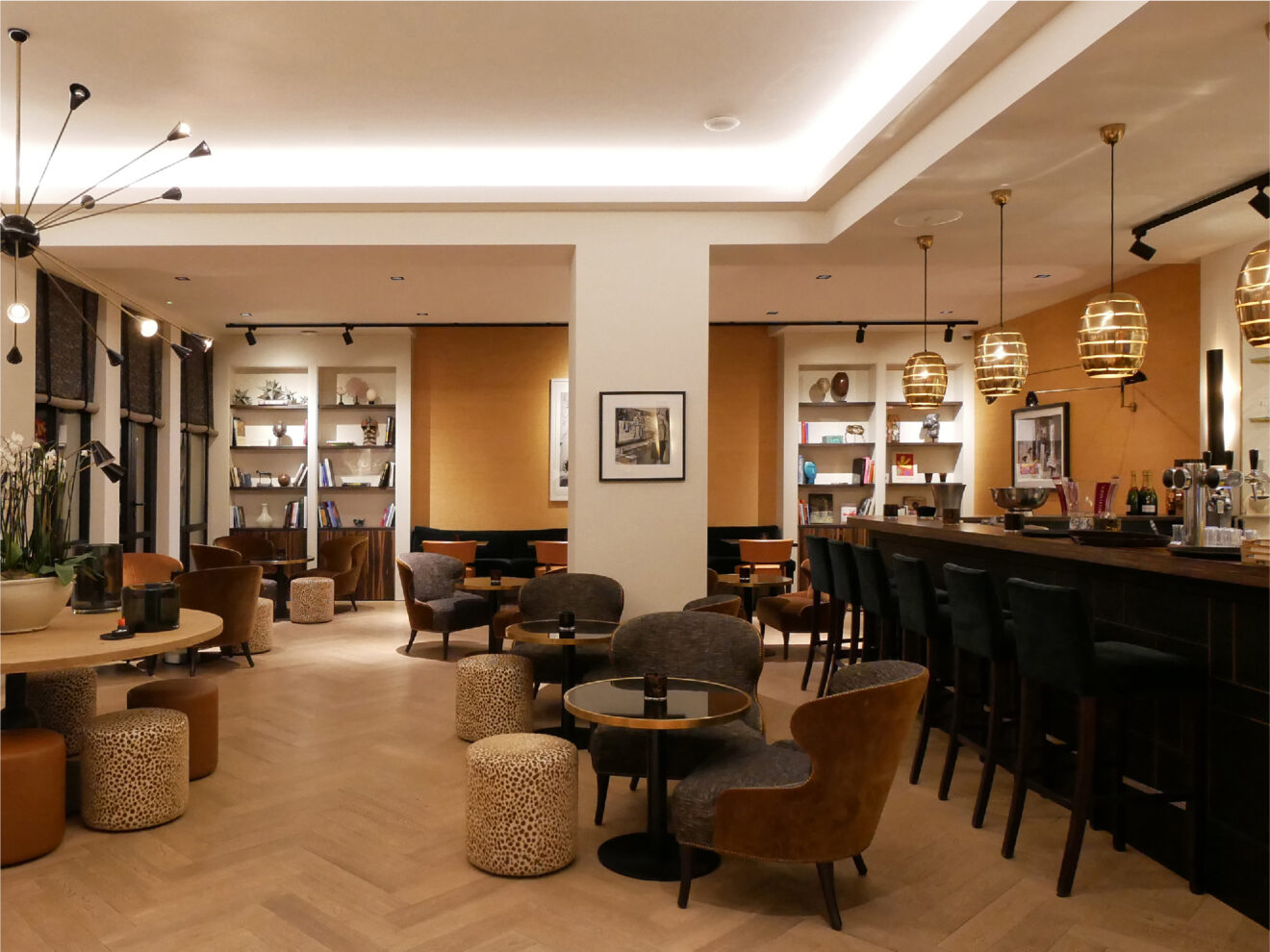
On this day a group of tourists has just arrived from Germany, and the area around the lobby is even more lively than usual. Further back on the ground floor is a combined café and library space, and one step up from it is a restaurant.
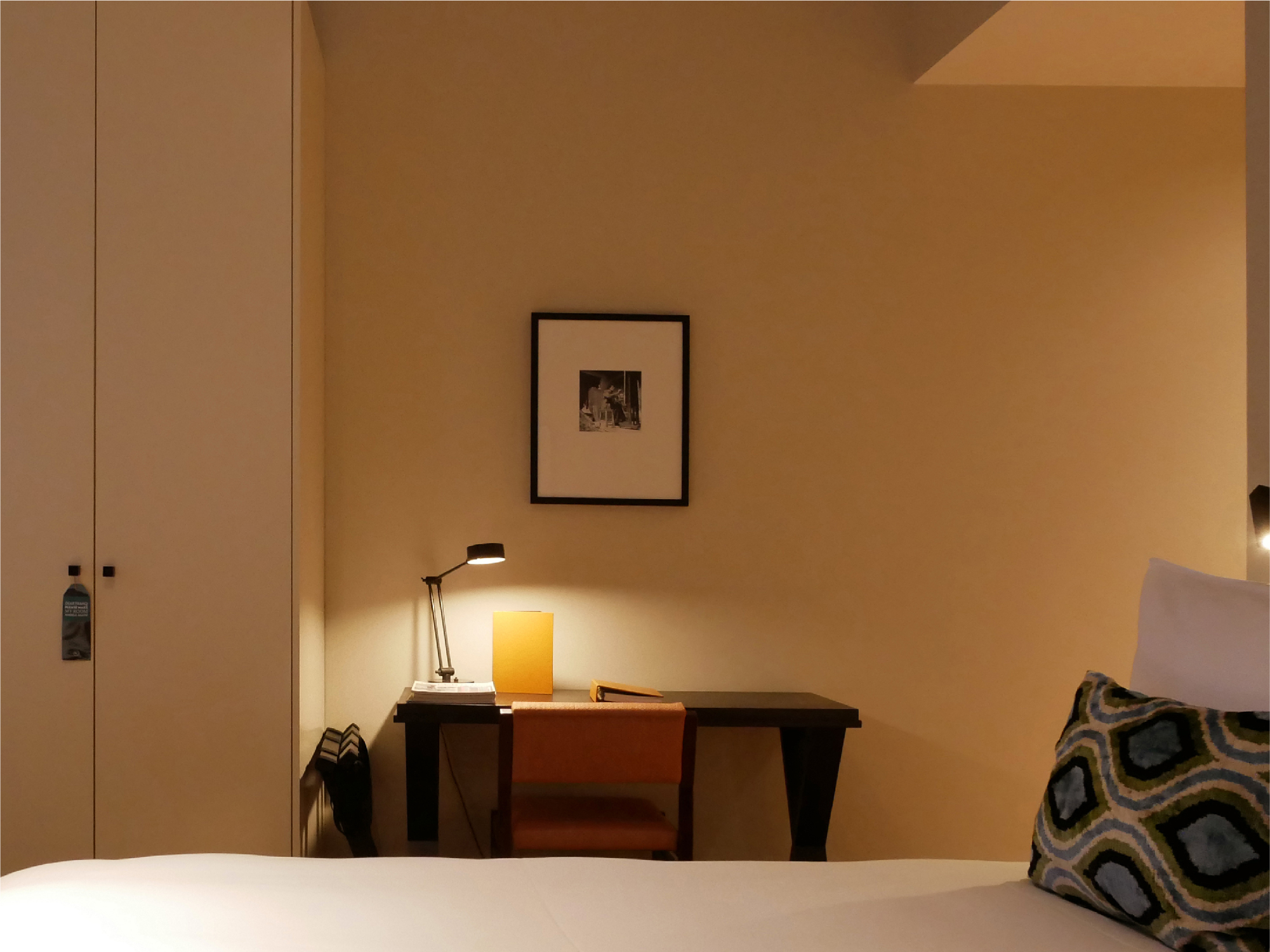
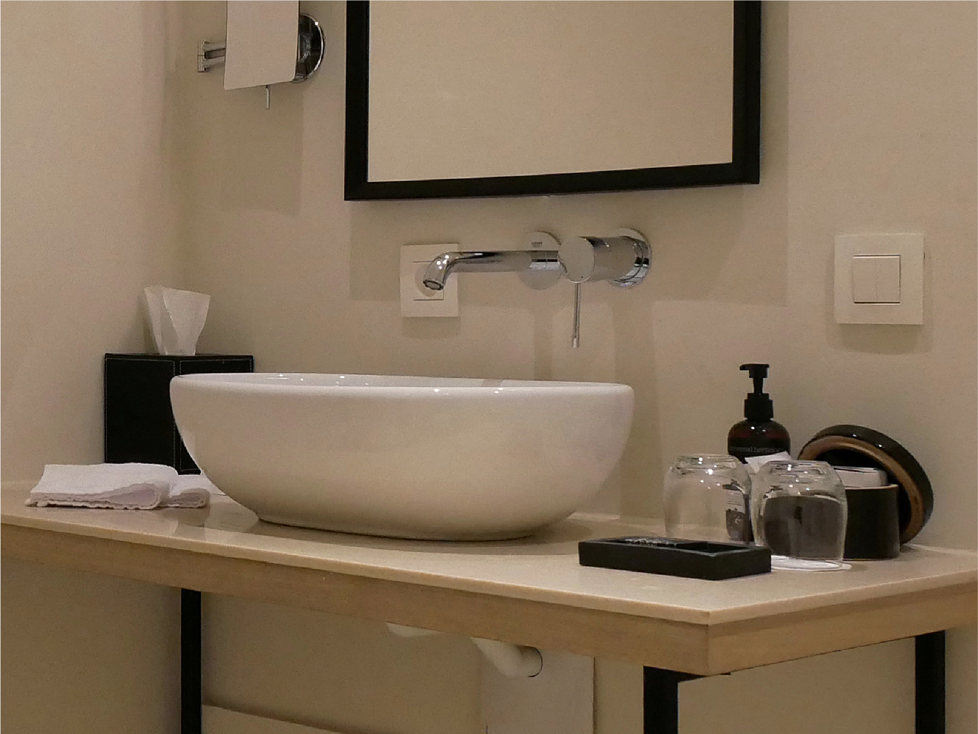
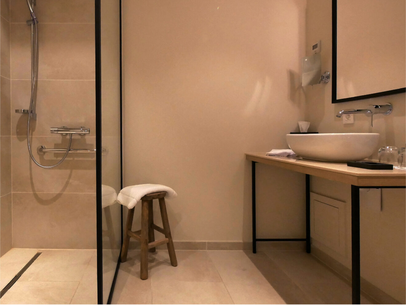
The room I was guided to gave me a general impression of simplicity. In both the living room and bathroom, the fixtures and guidance notices characteristically found in hotels are barely there to be noticed. When one is accustomed to staying in rooms with an abundance of objects and furnishings, the sparseness can feel unfamiliar at first, but once you get settled in, it gives way to a feeling of unencumbered pleasantness.
I’m reminded that I don’t care for spaces filled with things I don’t need to use in the first place. The first thing I will do after checking in, ordinarily, is clear all the unneeded things from the top of the desk and stash them away in a drawer. In this room, there was no need to even do that.
Something that lends the room a cozy “at home” feeling is the clean and pure style of its flooring. As a Japanese traveler, the feel of it makes me want to take my shoes off right away and walk barefoot on it. With its thick surface, it’s also durable enough to handle heavy suitcases and guests with their shoes left on without a problem.
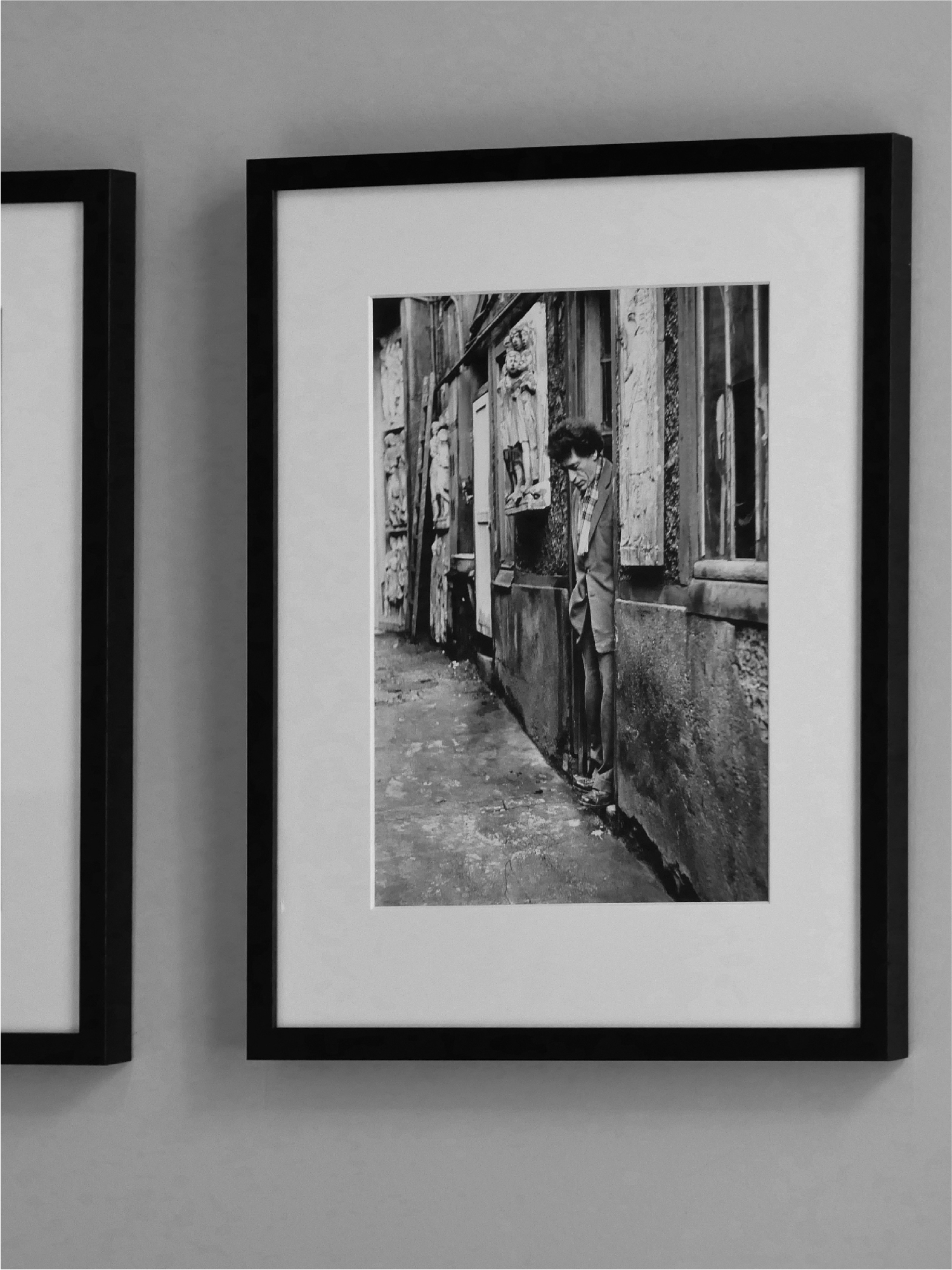
A Giacometti photo casually adorns the wall.
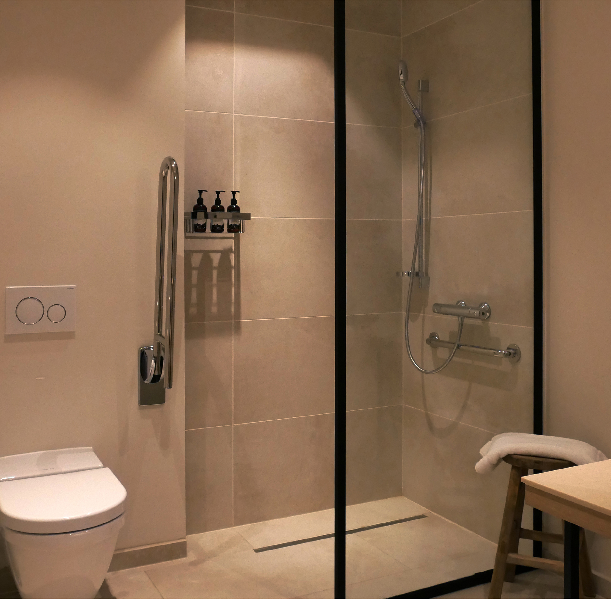
The completely barrier-free bathroom has been designed so that even guests in wheelchairs will be able to use the shower just as they’re seated. Such a degree of accessibility is attained with simplicity, just as might be expected here. It seems to reflect a soft questioning of tendencies to overthink “barrier-free design” in overcomplicated ways.
Come to think of it, the group of German travelers that had arrived in the lobby just before had seemed to be in around their 60s and 70s. German retirees with a healthy spirit of wanderlust might be a promising clientele for this hotel.
The ground-level restaurant, café, bar and free space are all connected without partitioning between them. As long as there are no guests making loud noises, this kind of open space plan has a freer feel to it.
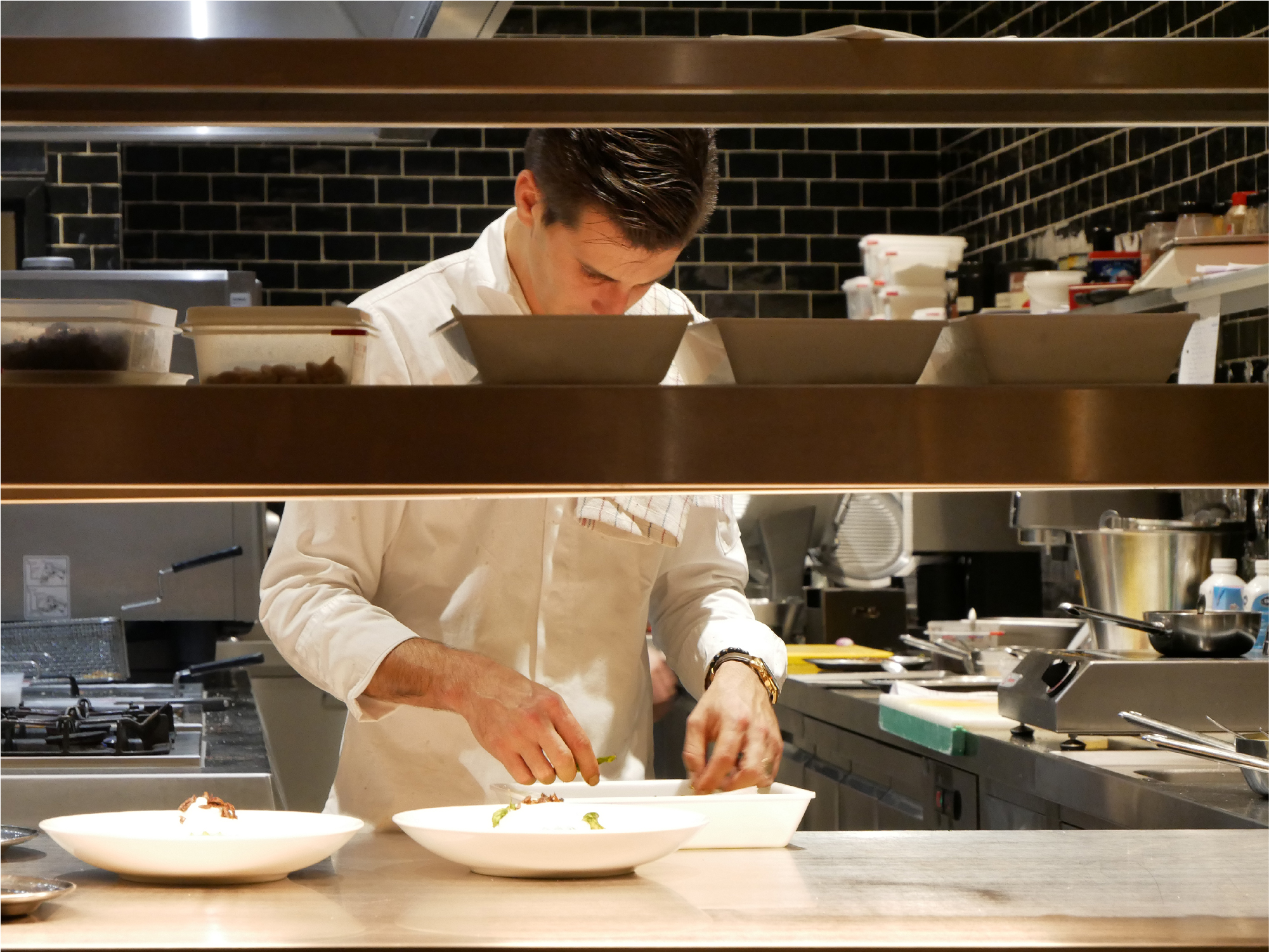
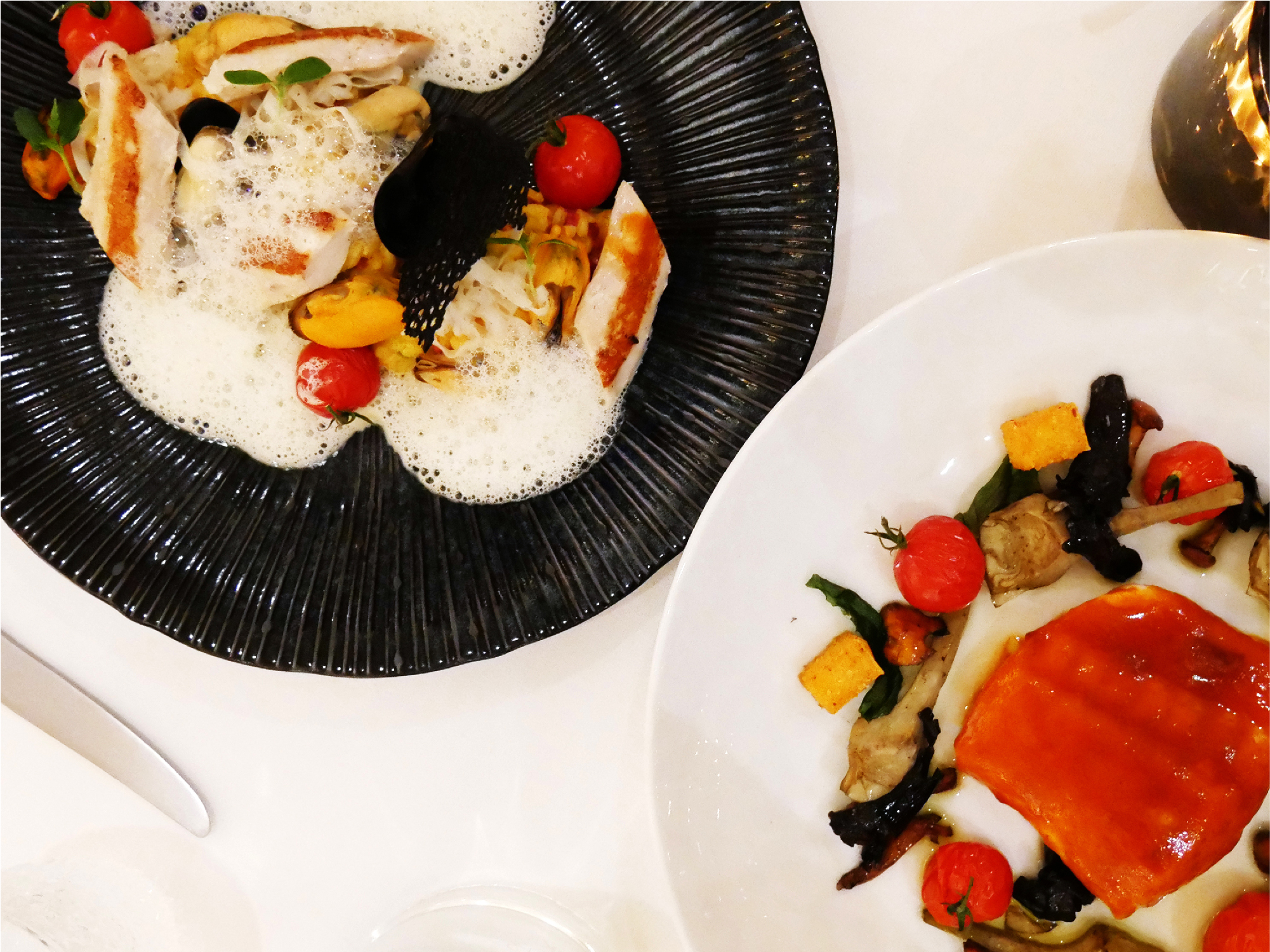
At the time of this writing, the hotel’s Restaurant FRANQ, headed by chef Tim Meuleneire, features a 1-star Michelin rating and offers French and Belgian cuisine for guests to savor. This does not seem to be just any old hotel restaurant.
The hotel’s rooms, while on the plain and natural side, were very nice spaces with a high-class feel. If anything, I will venture to say that the lack of a bathtub might be a little trying for Japanese travelers, but the relative spaciousness of the shower booth makes up for this somewhat and offers good convenience.
With its open layout that facilitates easy communication between guests, I got the impression that it represented the character of a friendly, open-hearted place.
